Category / CSS

0

Fixed-height elements with an intrinsic ratio

The padding-bottom technique is perfect when you need an HTML element to have an intrinsic ratio, provided the element is 100% wide. But it doesn’t work the other way around, when you want to set the element’s width as a percentage of its height. At least not without a helping hand from JavaScript.

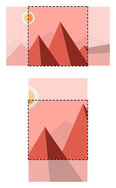
Here is a real world example of when this might be useful, an image carousel where the slides have a fixed height and variable widths:

At different viewport widths the carousel is taller, so we can’t simply hardcode each slide’s width. Before today I would have told you that the only reliable way of scaling the slides was to pass their aspect ratios to JavaScript, calculate the width of each slide relative to its height, then resize them accordingly. And to do that for every slide, every time the viewport is resized. It would be much simpler if the slides could be scaled once by CSS, but to achieve that we need a way to give each slide a relative width.

Continue reading

48

Center and crop thumbnails with CSS

Here is a handy CSS centering technique I first noticed in the WordPress media library, where it is used to centre and crop irregularly sized thumbnails within a square container.

cropped-thumbnails

The technique uses CSS3 transforms, so it works in all modern browsers, including IE9 and above.

<div class="thumbnail">
  <img src="landscape-img.jpg" alt="Image" />
</div>
<div class="thumbnail">
  <img src="portrait-img.jpg" class="portrait" alt="Image" />
</div>
.thumbnail {
  position: relative;
  width: 200px;
  height: 200px;
  overflow: hidden;
}
.thumbnail img {
  position: absolute;
  left: 50%;
  top: 50%;
  height: 100%;
  width: auto;
  -webkit-transform: translate(-50%,-50%);
      -ms-transform: translate(-50%,-50%);
          transform: translate(-50%,-50%);
}
.thumbnail img.portrait {
  width: 100%;
  height: auto;
}

The technique works by positioning the image so that its top left corner is in the centre of its container. Then, a 2D translation moves it up and left by half its own width.

The key here is that the percentage values passed to the translate function are relative to the element, not its container, as would be the case if we were to manipulate the element’s top and left properties instead.

View a demo

Note that the portrait format image has the class portrait, so that we can correctly scale it to fill its container.

So there you go. A really simple CSS technique for centering and cropping thumbnails.

12

Responsive elements that retain their aspect ratio

Here is a quick tip for creating responsive elements that retain their aspect ratio as they scale.

The problem

In a fixed width layout it is simple to specify both the width and the height of an element:

.rect {
    width: 800px;
    height: 400px;
}

When creating a responsive layout things get trickier, since (to the best of my knowledge) it isn’t possible to specify a percentage based height that is relative to an element’s width. For example the following CSS rule won’t have the desired result, since the height value will be ignored:

.rect {
    width: 100%;
    height: 50%;
}

Broken aspect ratio

A solution

However, when we specify a padding-bottom value for the same element, the padding measurement is calculated relative to the element’s width:

Continue reading

3

Goodbye conditional comments

The very first article I wrote on this blog, back in July 2006, was titled Goodbye hacks. Hello conditional comments. In that post I discussed how conditional comments could be used to feed different stylesheets to older version of Internet Explorer, smoothing differences between browser rendering engines without resorting to CSS hacks.

Conditional comments have provided a great stopgap measure while we wait for obsolete versions of IE to fall into disuse, but as the market share of IE6 and IE7 has dwindled I’ve found myself relying on them less and less. In fact, I can’t remember the last time I resorted to a separate stylesheet to make an old browser behave.

Continue reading

0

Getting unspecific with CSS

Anyone familiar with CSS will have encountered the concept of specificity, a nifty mechanism that allows web browsers to resolve conflicts between CSS declarations. Specificity is an essential component of the CSS cascade, and most of time it works in predictable ways which make your job simpler. However if you get too specific with your CSS selectors you might be making your stylesheets more complex than they need to be.

Continue reading

0

Best viewed in Safari

Remember when websites came with disclaimers listing their minimum viewing requirements, and shooed away anyone who didn’t make the grade? “This website is best viewed in Netscape Navigator” visitors would be advised, or “View this site in Internet Explorer at 800×600 resolution”. Those were the bad old days, and I would like to believe that as a community we have learned our lesson and moved on, embracing graceful degradation and progressive enhancement as alternatives to the “my way or the highway” mentality.

This morning I visited a website that caused me to wonder if we’ve come so far after all. I was looking forward to experiencing the site’s typography, which I’d been informed was exemplary, and was surprised when my browser served up fallback system fonts rather than the embedded web fonts I was expecting. A warning message in the masthead informed me that if the fonts looked “kind of weird” I should switch to Chrome or Safari.

Continue reading

21

Organise your CSS

Over the years I have streamlined the way I write and structure CSS to make my workflow more efficient. Here are a few tips I have picked up along the way.

Continue reading

13

Sunset: A syntax highlighting theme for phpDesigner

My weapon of choice for code editing is the excellent program phpDesigner, but every so often I like to test drive a different editor to see what I might be missing out on. Recently I spent some time playing with Notepad++, and one feature that jumped out at me was the ability to choose from a large number of pre-installed syntax highlighting themes.

When I switched back to phpDesigner, the default blue-on-white color scheme seemed a tad boring, so I decided it was time to pimp my IDE! Unfortunately user created themes for phpDesigner are thin on the ground, which left me no option but to make my own.

PHP example:

Sunset theme for phpDesigner - PHP code

Continue reading