Category / Typography

4

The true cost of H&FJ’s web font platform

Chris Bowler from the Campaign Monitor team has written an interesting comparison between Typekit and Hoefler and Frere-Jones’ new cloud.typography web font service. If you’ve been sizing up clouds.typography, or didn’t know that H&FJ has (finally) launched their much anticipated web font platform, go read his post.

hjf-clouds-578w

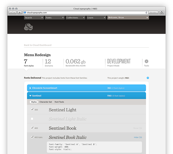
One thing that Chris didn’t touch on, but I think is relevant to the comparison, is that H&FJ’s annual subscription fees don’t actually give you access to their full range of fonts, just five font families:

Join Cloud.typography and get your first five webfont packages FREE

If you want access to more than five families then any additional fonts need to be purchased separately – currently H&FJ’s popular Gotham family costs $149 for a web font license, or $299 for a web and desktop license.

Continue reading

0

Host your own fonts.com web fonts

Self hosting

Monotype have added a feature to their fonts.com web font service, giving subscribers the option to host fonts on their own server.

This feature was previously only available to customers who purchased extended Web Fonts Services licensing, but now anyone with a Professional account can opt to self-host. In addition to the traditional font embedding methods subscribers can download a self-hosting kit containing their typefaces in various formats, ready to deploy to their web server.

When Typekit launched in 2009 one of the reservations I expressed about subscription web font services was their reliance on Content Distribution Networks (CDNs), which introduce a potential point of failure. I’ve not had any problems with fonts.com’s CDN, but self-hosting is apparently one of their most requested features, so it’s good to hear that it’s now an option. MyFonts already allow customers to self-host their web fonts, and it will be interesting to see if other font venders follow suit.

Continue reading

0

Best viewed in Safari

Remember when websites came with disclaimers listing their minimum viewing requirements, and shooed away anyone who didn’t make the grade? “This website is best viewed in Netscape Navigator” visitors would be advised, or “View this site in Internet Explorer at 800×600 resolution”. Those were the bad old days, and I would like to believe that as a community we have learned our lesson and moved on, embracing graceful degradation and progressive enhancement as alternatives to the “my way or the highway” mentality.

This morning I visited a website that caused me to wonder if we’ve come so far after all. I was looking forward to experiencing the site’s typography, which I’d been informed was exemplary, and was surprised when my browser served up fallback system fonts rather than the embedded web fonts I was expecting. A warning message in the masthead informed me that if the fonts looked “kind of weird” I should switch to Chrome or Safari.

Continue reading

1

Font Squirrel’s @font-face kit generator

If you want to create your own @font-face kits, you absolutely must check out Font Squirrel’s new @font-face generator tool. All you have to do is upload a TrueType or OpenType format font, and the generator spits out a zip file containing:

  • The original typeface for Safari and Firefox 3.5
  • A WOFF font for Firefox 3.6+
  • An SVG font for Opera, Chrome, and iPhone
  • An EOT font for Internet Explorer
  • A sample HTML page
  • A sample CSS stylesheet

The generator also features options to reduce file size by subsetting the font, cleanup font outlines, and auto-hint glyphs to improve rendering.

Font Squirrel Generator

Sweet!

1

Typekit and the future of web fonts

Now that all major web browsers finally support the CSS @font-face declaration, embedding fonts in a web page is possible with just a few lines of CSS. In theory this means that web designers no longer need to limit their font choices to a handful of system fonts, and are free to use any typeface they please. In practice that freedom comes with a caveat: we are only allowed to use fonts with a license agreement that allows web embedding.

The trouble is that digital fonts have no provision for DRM, and pirating a copy of an embedded web font is a trivial exercise for anyone with the mind to do so. That’s obviously not a prospect type foundries are too keen on, and consequently no major foundry offers a licensing option for embedding their fonts in a web page. If you link to a commercial font from your CSS stylesheet the chances are that you are breaking your license agreement. Even the number of free fonts with an EULA that condones @font-face embedding is pitifully small.

That’s where Typekit comes into the picture. Typekit is a new font delivery service devised by Jeffrey Veen that promises to take the pain out of licensing fonts for web embedding. In their own words:

We’ve been working with foundries to develop a consistent web-only font linking license. We’ve built a technology platform that lets us to host both free and commercial fonts in a way that is incredibly fast, smoothes out differences in how browsers handle type, and offers the level of protection that type designers need without resorting to annoying and ineffective DRM.

Continue reading

12

Reconsidering Arial

My friend John Gillespie recently wrote about the inauspicious origins of the Arial typeface, namely that it is a blatant copy of Helvetica. While I agree with the general thrust of John’s argument (I’m a self confessed Helvetica fanboy) I do think that Arial has one redeeming feature that deserves mention, especially in the context of web design: Arial renders better at small point sizes on Windows systems than Helvetica does.

Continue reading

14

Link hide-and-seek

An article on the importance of making hyperlinks stand out might seem like an exercise in stating the obvious. I would have thought so too, until I came across the portfolio site of a reputable web design firm last week and found myself playing a game of link hide-and-seek.

Continue reading

41

The visual design of Web 2.0

If you didn’t blink, you may have noticed that for a few days recently Wikipedia’s entry for Web 2.0 included a subsection describing the visual elements of Web 2.0. Gradients, colorful icons, reflections, dropshadows, and large text all got a mention.

A few days later the “visual elements” addition had been removed after a vote by wikipedians. The objection, I suppose, is that no set of visual criteria can accurately define something as being characteristic of Web 2.0 – if Web 2.0 can be understood as an approach to generating and distributing content, then it needn’t be tied to a particular visual style.

Nevertheless, it’s true that many Web 2.0 sites do share a distinctive aesthetic. Wikipedia’s editors may not think it’s a worthy part of the Web 2.0 discussion, but I say bring it on! Let’s take a look at the some of the communication issues facing a Web 2.0 site, and see how the “Web 2.0 look” can help to solve them.

Continue reading

0

Relative font sizing made easy

If you’ve not already done so, it’s time to ditch pixels as a unit for sizing fonts. Sizing fonts for the web using ems and relative dimensions is easy and accurate. No really, it is.

Continue reading