Behind the ExpressionEngine redesign
I’ve long been a fan of Jesse Bennett-Chamberlain’s design work, and appreciate how openly he talks about his design process. Jesse was responsible for the recent redesign of the ExpressionEngine website, and over at Digital Web he gives us a warts-and-all walk through of the project. The article provides a fascinating insight into the workflow and problem solving methods of a talented web designer.
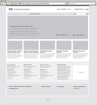
One thing that stands out to me about Jesse’s process is his use of wireframe mockups. While many web designers are content to scribble a rough sketch of the site layout and then leap straight into a full blown design, Jesse starts his designs by creating very accurate greyscale wireframe mockups. This approach seems to work very well for him, and you can observe how the strong grid structure and content organization of his wireframes are carried through into the final site.

Another tip I gleaned from Jesse’s Digital Web article is the source of the beautiful icons he uses on the site. They are created by Icon Drawer, and retail for $84, which seems very reasonable for a collection of 140 top notch icons.
Jesse’s article is the first in an ongoing Digital Web series called “The Working Designer”, in which leading web designer’s walk the reader through their design process. It is sure to be a fascinating series, so keep an eye out for future installments.
4 thoughts on “Behind the ExpressionEngine redesign”
Comments are closed.
I am at the moment just starting to use something similar to his wireframing and so far it has been very useful.
Read more hear grayscreen prototype
I’m also just beginning to take my wireframes a step farther from the rough sketch on pad and paper. It’s challenging now that I’m just starting, because I often forget I’m not in the designing phase yet, just organizing and structuring the page.
It does make for a more fluid transition into the design phase, and saves you time when you can show a client exactly how the layout will be without all the bells and whistles of color palette, typeface, and graphics.
@jenn.suz.hoy: When I’ve tried creating complex wireframes I also tend to get ahead of myself and start designing the site! Jesse’s wireframes are fairly resolved in terms of layout (it’s obvious he has a clear vision for the final site design), but he manages to hold back from addressing issues of color, imagery, and graphical decoration. I guess that’s the trick to successful wireframing.
@Jermayn: I’ve downloaded the ebook mentioned in your blog post, and had a quick look through. I think the author’s “grayscreen prototyping” thesis is solid, and the information design principles covered towards the end of the book look interesting too.
Yeah it is solid and worth a read. Some of it will not be your style of meat for you but a lot will be. Pick out the bones and you will have a great feed :D
Just remember that some of it was written back in the early 2000s but is still relevant. Thanks for reading my post btw