Styling links
A couple of months back I wrote a post about the importance of making links look like links. From the comments left by readers it was clear that peoples opinions differ widely on the best way to style links, so I thought I’d follow up with a brief survey of the various ways it is possible to make links stand out on a page.
I won’t be talking in this article about links in navigation menus, headings, or buttons, only inline links that appear within the body copy of a web page. We cannot rely on visual context to make it obvious to users that inline links are clickable, and therefore their appearance is crucial.
Browser default

Lets start by considering how hyperlinks look when they have no CSS styling applied to them. In any mainstream web browser links are blue and underlined by default, visited links are purple, and there is no hover behavior when the user moves their mouse over a link. Letting the browser determine the look and behavior of links is an approach favored by usability advocates such as Jacob Nielsen, since it won’t disrupt a user’s expectations of how a webpage functions. Nielsen doesn’t admonish designers for changing the color of links, but he considers hover states to be unnecessary visual clutter, and recommends that inline links should always feature an underline.
Mimicking the browser default

For those who adhere to usability principles but still want to get their design groove on, styling links to closely emulate the default browser behavior is a popular option. Consider web application developers 37Signals, whose own website features underlined links colored a tasteful navy blue, with no hover state. Because links styled in this manner look and behave very much like the browser default they are recognizable even to a novice web user, but the customized blue integrates better with the overall page design and stops the site looking ‘vanilla’.
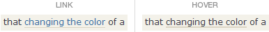
Changing the link color

For designers who consider underlines to be overkill, color differentiation is enough to make links stand out from surrounding text. This approach works well when a unique color is used to style links, however problems can occur when links and headings share the same color. Without an underline it is tricky to tell when text is colored to indicate that it is clickable, and when it is colored merely for decorative effect.
Getting creative with the underline

By using the CSS border-bottom property it is simple to control the look of a link’s underline. For instance you can make it a different color to the link text, make it thicker that one pixel, or make it dotted.

A dotted line underneath link text provides a compromise for designers who dislike the severity of a solid underline but still want their links to stand out. Dotted underlines are not used on a great many websites, possibly because of the fact that browsers render the dots differently (in Internet Explorer 6 a CSS dotted line looks like a series of dashes). I suspect that this unpredictability has been a turn-off for web designers who want their layout to render consistently between browsers, although that is going to change as IE7 usage grows.
Bold

One of the simplest ways to add emphasis to links is to make them bold. Some designers consider that bolding alone is sufficient to make links stand out from surrounding copy. This is practical on personal sites, where the designer can carefully monitor site updates and make sure that link text is the only text that is ever bolded. For sites where the client or a third party is in charge of making content updates links should still be a different color, or underlined, to avoid potential confusion.
Background color

Changing the background color of links is usually reserved for their hover state (see below), but on some sites links have a background color all the time. Usually the background color is quite striking and the link text is reversed out, but in some cases a more subtle background is opted for.
Hover states

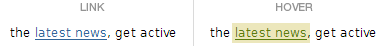
As I mentioned earlier, by default links do not have a hover state associated with them – in other words, the visual appearance of a link doesn’t change when the user moves their mouse over it. The widespread adoption of CSS for styling text in the late 1990s changed that situation, and today most links feature a hover state. A hover might be as simple as the text changing color, or the removal (or addition) of a decorative underline. More adventurous possibilities are changing the background color of a link, or varying the thickness of its underline.
Visited links


Links to previously visited pages are traditionally styled to be distinguishable from unvisited links. By default they are purple, whereas an unvisited link is blue, and this difference provides users with a visual clue as to where they have been before. When it comes to styling visited links the key is to give them reduced visual emphasis. This can be achieved by making them a less eye catching color than unvisited links, removing their underline, or adding a graphical cue such as a tick next to them. Not so long ago there was a trend to style visited links with a strikethrough – I am not a fan of this technique at all, because it obscures the text and worse still, implies that that the link is inactive. Thankfully examples of this misguided approach seem to have dried up.
Links that open a new window


When clicking a link will trigger the launch of a new browser window, it is courteous to provide a cue that this is going to occur. The addition of a small ‘new window’ icon to the right of a link lets users know that a browser window is going to open, without the need for a written explanation.
Conclusion
While I would hardly say that the sky is the limit when it comes visually styling links, there is certainly enough spectrum to get creative with the way we design them. The examples I’ve shown in this article cover all the different techniques I’m familiar with, but if you think I’ve missed one out please post a comment below.
Further reading
Where are all the visited links?
Today many websites have done away with the concept of visited links, choosing to style them identically to unvisited links. Lisa Herrod wonders why.
Don’t be the weakest link
Just because you can style a link any which way you fancy, doesn’t mean that you should. Paul Boag explains ‘best practice’ techniques for writing and styling links.
Guidelines for Visualizing Links
Love him or loathe him, Jacob Nielsen delivers some solid advise about the usability implications of changing the appearance of links.
14 thoughts on “Styling links”
Comments are closed.
Maybe I am biased but I think the normal underline (border-bottom or default) is the best practice. I think background color is passable and just bold without any color difference is poor imo.
I think technically a hover link should have a difference even if slight.
For opening in new windows I think the little icon next to the link, should be the actual link to open in a new window.
Nice article. Although nothing really new for me, it opened my eyes in thinking about how to style links. The little tick icon on visited links is a nice visual idea.
Yeah the tick method is a nice idea but I think a different colour is more suitable
Changing the link colour and not having an underline or bottom-border should be avoided as they may not be readable by people with various levels or kinds of colourblindness.
Nice article.
One of the things that I find that is never discussed is contrast in links — does that matter?
In many sites that claim accessibility and even some of those who promote accessible tools, many of their links don’t pass the contrast measure.
Does contrast in links matter?
Cheers,
tedd
@Tedd: Good point. Providing sufficient contrast in links is a WCAG guideline:
Guideline 2. Don’t rely on color alone.
2.1 Ensure that all information conveyed with color is also available without color, for example from context or markup.
2.2 Ensure that foreground and background color combinations provide sufficient contrast when viewed by someone having color deficits or when viewed on a black and white screen.
http://www.w3.org/TR/WAI-WEBCONTENT-TECHS/
Jonathan:
Jonathan:
Interesting, but the guidelines you cited really don’t address links. For example, there are four states of a link, namely link, link-visited, link-hover, and link-click. How does one show the difference between text and those states of link on a black and white monitor?
You see, there is a limit to the amount of information that can be conveyed by contrast differences between five different states in shades of black. For example, on a white background standard text needs to be of at least a black shade of #585858 to meet the initial contrast requirement. If the text is #585858, then what shade of black would be sufficient to provide enough contrast to identify it as a link, as compared to text? And after that, what contrast is available to show a visited link, a link hover, and then a link-click? I think you will run out of shades of black before you solve them problem — am I wrong?
Thanks,
tedd
@Tedd, I think if you cannot choose contrasting colours yourself you can use a third program which will be able to do it for you.
@Tedd: Yeah I see what you mean – and you’re quite correct, the WCAG guideline I quoted from doesn’t specifically talk about contrast between text and links, only contract between background and foreground colors.
If we look at WGAC 2.0 Levels 2 & 3, these guidelines also don’t specify that active/visited/hover links need to have differing contrast values, only that the luminosity contrast ratio between text/links and background color is at least 5:1.
But yeah, you’re going to have no luck coming up with 5 greys that are easily discernible from one another, and are darker than #585858. If it’s something you are concerned about (which it must be or you wouldn’t have mentioned it!) then perhaps using visual cues other than just the link color provides a solution.
For starters I would suggest that adding an underline solves the most significant issue – making links stand out from other text.
On hover you might remove the underline or change the link background color, for visited you might put a tick icon (or similar) next to the link. Regardless of contrast differences these indicators would still be apparent on a black and white monitor.
Jonathan:
I can always figure out a way to solve the contrast problem by using other techniques, including using those put forth by your article — very nicely done, I might add.
I was simply demonstrating that the guidelines aren’t always a solution to the problem and we as developers should use the guidelines as suggestions and not as rules. As such, your article, in addition in showing neat ways to do links, also demonstrates solutions for contrast issues with links.
Cheers,
tedd
@Tedd
If you read my post about taking a pragmatic approach to validation you’ll know that’s a sentiment I share! Although unlike validation, in certain countries it is a legal requirement for websites to meet a minimum level of accessibility…
Truth be told, accessibility isn’t something I spend a whole lot of time thinking about, but I’m very pleased to see the topic get some airtime on this site.
Accessibility is a bit over rated and also greatly mis-understood imho….
@Danny – Sorry I only moderated your comment just now. It got tagged as spam for some reason!
If you’ve not seen it already, there is an online tool called VisCheck for approximating how a webpage will look to people with different forms of color blindness.
[…] Jonathan Nicol, who is ever so generous with his comments on this site, curated a nice collection of approaches to styling and denoting links. To return the favor of furthering the conversation, here is my remix of the topic. Styling links […]