The visual design of Web 2.0
If you didn’t blink, you may have noticed that for a few days recently Wikipedia’s entry for Web 2.0 included a subsection describing the visual elements of Web 2.0. Gradients, colorful icons, reflections, dropshadows, and large text all got a mention.
A few days later the “visual elements” addition had been removed after a vote by wikipedians. The objection, I suppose, is that no set of visual criteria can accurately define something as being characteristic of Web 2.0 – if Web 2.0 can be understood as an approach to generating and distributing content, then it needn’t be tied to a particular visual style.
Nevertheless, it’s true that many Web 2.0 sites do share a distinctive aesthetic. Wikipedia’s editors may not think it’s a worthy part of the Web 2.0 discussion, but I say bring it on! Let’s take a look at the some of the communication issues facing a Web 2.0 site, and see how the “Web 2.0 look” can help to solve them.
Trust me, I’m Web 2.0
Integral to Web 2.0 is harnessing the input of website visitors. Users can generate content for a web service, promote it in a “viral” peer-to-peer fashion, and improve it’s data quality through their opinions and preferences.
But to convince a visitor to contribute their time – and data – to a web application, you need to get them to trust you first. Most Web 2.0 sites come across as friendly, approachable and small-scale, using subtle design decisions to gain our trust.
Green is the new grey
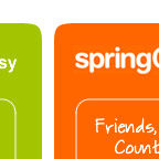
Bright, cheerful colors dominate Web 2.0 sites. Green is the unofficial color of web 2.0, but saturated blues, oranges and pinks are also favourites. Bold primary colors suggest a playful, fun attitude and also help to draw attention to important page elements.
Rounded everything
New CSS techniques for achieving rounded corners have helped make this style hot again. The friendliness of rounded corners is in keeping with the comfortable, informal tone of many web 2.0 sites.
In a great FontShop article analysing the logos of Web 2.0, it was clear that rounded typefaces are all the rage. This smooth approach to type lends a modern playfulness to a company’s visual identity.
Free, as in beer
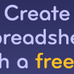
If you’ve got to convince visitors to sign up for your killer app, giving away FREE accounts surely can’t hurt. Most Web 2.0 sites devote prime real estate to the message that they offer a free service. If that message can appear inside of the ubiquitous ‘starburst’, all the better.
No (stock) photos please
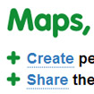
You won’t find any stock photography of smiling support staff on a Web 2.0 site – that’s a tactic favored by small companies trying to mimic large corporations. Simple icons and screenshots are the order of the day when it comes to imagery on Web 2.0 sites. 3D and beveled icons can lend elegance and polish to a page design that is otherwise fairly stark.
Keep it simple stupid
Most Web 2.0 applications add an additional technological or organizational layer to the user’s web experience. Be it managing links with del.icio.us, sharing photos with flickr, or organizing tasks with Backpack, we have to familiarize ourselves with a new technological process and devote time to managing our content. A good Web 2.0 app ought to be lightweight and easy for users to grasp, and clever visual design and copywriting can help remove barriers to entry.
Smart use of layout, color, type and copy can go a long way towards easing the pain.
Big is beautiful
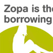
As far as Web 2.0 is concerned, bigger is definitely better. Bigger text, that is. Large text is easy on the eye, and coupled with snappy copywriting makes information easy to absorb. And now that accessibility is cool, it’s possible to be a hotshot web designer and use enormous type. Admittedly this craze for giant text strays too far into Jacob Nielsen territory for my taste – when a web page’s body text is set at larger than 13 point it looks like a “learning to read” book to me!
Breathing space
The layout of Web 2.0 sites might be described as minimal. With a focus on legibility and ease of use, good use is made of white space. White space allows important information to stand apart, provides rest for the eye, and imparts a sense of calm and order. Generous leading also makes text copy easier for the eye to follow. Some Web 2.0 layouts are so minimal that they verge on boring, but designed well, an uncluttered page can be incredibly tasteful.
Clever copy
Friendly, informal copywriting allows a more personal relationship with website visitors. A List Apart singled out Flickr and Photojojo for an honorable mention in this department, and it’s a lesson that many Web 2.0 sites put into practice. WebTango isn’t just free, it’s “free of additives, cholesterol, ozone-depleting CFCs, and most importantly, free to use”. Tioti doesn’t just have tagging and RSS, it has “tagging and RSS up the yazoo”. FAQQLY founder David Liu isn’t a isn’t a faceless entity, Dave is “your first friend once you register”. And the toolbar on eSnips isn’t just flexible, it’s “a toolbar you can use in a bunch of cool ways”. You get the idea.
Odds and ends
There are a couple of visual tendencies amongst Web 2.0 sites that don’t seem to answer a particular design problem, but deserve a mention nonetheless. The ‘wet table’ look, ‘starbursts’ (also known as ‘flashes’ or ‘violators’), and ‘glass’ buttons, provide a lot of Web 2.0’s eye candy. Apple’s marketing department sure has a lot to answer for.
Conclusion
So that’s my quick tour of the visual design of Web 2.0. Who knows, the “Web 2.0 look” may be out of vogue a year from now, but I think it offers good lessons about effective design for the web that deserve to have a much longer lifespan.
Further reading
What is Web 2.0?
Straight from the horse’s mouth.
The Logos of Web 2.0
Examines trends in Web 2.0 logo design, and identifies the most popular typefaces.
Current style in web design
The inspiration for this article. Sums up the current trends in website design.
The Web 2.0 Awards
Discover a gazillion Web 2.0 sites you never knew existed.
Translations
This article has translated by readers into the the following languages:
41 thoughts on “The visual design of Web 2.0”
Comments are closed.













I found the thumbnails very helpful and useful. I only wish they linked to the full page so one can see the graphical elements in context. Since pages are liable to change, the best (although time consuming approach) would be to link to screenshots saved on your server. It would serve as a nice archive / time capsule years down the line.
@Ephram Zerb: Thanks for the suggestion. I still have all of the original screenshots, so when I get a moment I’ll upload them.
Great writeup! The only thing I think you were missing is the “mascot element” that so many web 2.0 sites now have. I’m thinking mostly of the reddit alien (http://reddit.com) but a number of sites have copied this idea — even the digg mascot has gotten bigger and more prominent over the last year.
Wow. This is a great article and must have taken a significant amount of time to write. Thank you. Its very interesting how introspective we have become in terms of looking at web trends and writing about them. Also, green is definitely the new gray. :)
One thing I used it for is just to find some cool web 2.0 sites I hadn’t seen before.
Thanks again! Dugg!
Thanks for putting out the obvious yet again. Im so sick of people on their ‘blogs’ thinking that they are different and extreme design aware by simply telling people what web 2.0 is……how insightfull! its amazing you can really spot the trends!
I had a go at Web2.0-ifying my site. I reckon it looks better than it did in version 1.0(?) but I reckon most visitors will have to wait until 2.1 until it’s adopted as a model in its own right.
A nice and efficient summary !
Good summary – thanks!
[…] Instead, I think I’ll be thankful for free speech, with a little web 2.0 goodness mixed in. I’m talking about Standpoint, a website that allows you express your beliefs in a number of different ways. […]
great job! thanks for the analysis. helps me decide what i want to put up in my next website.
Thanks for the writeup. Its nice to see a bunch of these things alongside each other, illustrating the overall concepts more easily.
Web 2.0 Visuals.. hm..
all of the above, except you forgot..
a whole army of ugly ugly iMac wannabe logos.
I don’t want every other site to look like Candyland.
The onslaught of ugly Web 2.0 logos is too much !!!
Interesting that Wikipedia has split off the design element.
While my original article, which you link to above, actually never mentioned Web 2.0 at all, until the links at the bottom, everyone’s calling it “Web 2.0 Design” in links, diggs etc.
I’m not sure it is right to separate Web 2.0 as a social/technological phenomenon, leaving out the social/cultural element. Is it coincidence that the new wave of social networking, re-mixing and community-fed web sites has come about at the same time as a certain visual language? I don’t think so. I believe that part of the buzz of Web 2.0 is the look and the feel.
Great work.
Wow, this article got Dugg! 14,000 visitors in one day, jeez louise… Thanks for all the feedback both here and on Digg, positive or otherwise. Here are a few responses to specific comments:
@myrtle: you’re right that a lot of logos feature some sort of ‘mascot’ – I guess it adds to the friendliness factor.
@Ian: My intention with this article was not to explain what Web 2.0 is – I wanted to examine the visual language that accompanies it. I have seen a lot of people point out the constituent components of a ‘Web 2.0 style’, but haven’t seen anyone try to explain the underlying design purpose of these visual elements (the closest being Ben’s article, though as he points out in his comment he was talking about web design in a broader sense, not focusing specifically on Web 2.0 sites).
@somebody: Sick of the onslaught of Web 2.0 logos? Well you’ll love this. Heh heh…
@Ben: I actually took a screenshot of the Wikipedia article while it still included the ‘Visual Elements’ section. Check it out. Thanks again for your excellent ongoing ‘trends’ article on Web Design From Scratch, and the inspiration to write my own piece on a similar topic!
This tute ROX! Dude!!!
Excellent summary. Very much insightful on what is going on about this Web 2.0 trend. And this is a very much unique angle to watch this hot topic tool. Thank you very much for your hard work on writing this.
nice observation and well-prepared article! i couldn’t leave the page without sayin thanks!…THANKS!
and this’s the challenge of web 2.0, you’ve to code everything yourself.. having a great Idea for a website -that can be categorized as one of the 2nd internet wave- is not enough with a little background of coding. I mean knowing how to make a blog (by wordperss) or forum (by vBulliten) or a huge site using dreamweaver or frontCage will not help..
it neeeeds alot of knowledge! just look@digg, flickr or wiki.. it’s growing like hell but organized cuz it’s based on smart UFO science… everyday i try 2quit learning “i’m not gonna do it alone!”.. but for the fact that we’re all humans from one father and one mother… I’m hanging on the hope branch and lookin with fear @ the deep ocean below!
Hi,
your article was really helpful for me.
I like the idea that Web2.0 applications follow a certain design.
Thanks and a big hello from germany
This article is SPOT ON. Nice work.
Suggestion: post a couple of resources for those that are looking to develop some Web 2.0 design. Example for how to do the rounded corners in CSS, for one.
Great article!
I always use websites like http://www.screenalicious.com when in designing a new site it contains the largest design showcase with lots of web 2.0 sites.
There’s a flip side to this I reckon. The “web 2.0” look connotes new-ness, which I find raises some warning flags for me – particularly regarding issues of trust. When a site gets the web 2.0 treatment I have to wonder how its funded, how long it will be around, will the inevitable next owner respect the current privacy policy, is security planned for “phase 2”, how about scalability? If look and feel have a role in shaping how we regard a site, service or company it might pay to mix in some old fashioned with the new.
very interesting….thanks…
Great summary, thanks very much!
Greetings from Germany,
Steffen
very helpfull , thanks
Russian translation: http://web2rus.blogspot.com/2006/12/web-20_08.html
thanks very much~~~~~
Great article! I am actually in the process of developing a new member based site, and want the clean design of 2.0 sites. This article helps alot. Thanks from Alaska.
This article had been reprinted broadly.
Now I find the ORIGINAL.
Just to say thanks alot.
first i want to thank for the nice write up,
i do have one comment, it’s not that sites shouldn’t be friendly user, but I’d still like to see a different identity from one site to another…
LOL, I am definitely guilty of that one.
Something beautiful just catches and everyone runs with it. I think we will slowly start to see a shift as the above outlined elements are already starting to feel dated and overly used. Fashion and design seasons aside, most of the Web 2.0 elements are for the better, the easy to read text, bright, well contrasted colors, really aid in promoting a positive experience for the user.
May I translate this article to Polish ?
@decimus – Sure, feel free. Let me know the URL of the translated article and I’ll link to it from here.
What a brilliant article. Thank you for writing it, and for the work that went into it. It has made it easier to focus on the next stage in my project management at work and given me some interesting ideas for my personal site.
Thanks!
I agree almost with everything, especially with cheerful colors, that makes sites more attractive. But to my point it’s not necessary to use big letters, cause it can restrict space for useful information.
So, what happens when the “web 2.0” design is everywhere and gets boring and lame? It of course will happen as everyone jumps on the bandwagon.
Isn’t it better to trust your instincts, know your audience and design a classic web site using the best practices and knowledge from a lifetime of experience? Of course slowing improving and morphing over time.
Any person who is always wearing the latest fashion looks cheap, unreliable and unimaginative. Is the same for a for a web site chasing the latest and greatest design?
I don’t know, I’m just posing the question.
That was an awesome article about Web2.0 designs . Thanx a ton !
Hi
Very interesting information! Thanks!
Bye
Great post – Not much has changed in the past 12 months.
Great article! Thanks for sharing your knowledge.
Great article! Thanks.
This is a good round up of current trends. I think one of the main issues in Web 2.0 design is also simplicity – designing easy to use, easy to understand sites. The priority should be designing the content, rather than just making it look ‘cool’.
A great resource to look at is Web Design from Scratch (http://www.webdesignfromscratch.com). Their book ‘Save the Pixel’ is definitely worth a look.