mtv.com abandons Flash experiment

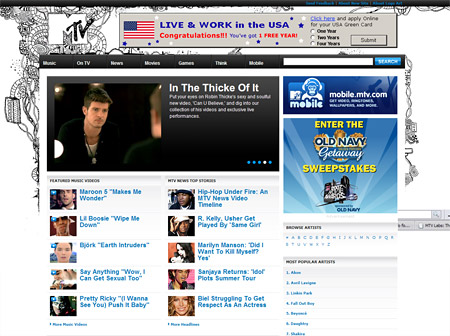
Back in October MTV redesigned their flagship site mtv.com using Flash. Last week they redesigned the site again, abandoning the Flash experiment and reverting to an HTML design. On the MTV Labs blog MTV cite user dissatisfaction with the Flash version as being the primary reason for the switch. Alexa traffic stats show that the site had its lowest usership ever during the 8 months the Flash site was running.
Curiously, much of the feedback from users on the new redesign has been negative. Largely, it seems that users are dissatisfied with the way video plays on the new site, with many complaining that video loads slower or is blocked. Of course user criticism should be taken with a grain of salt – in my experience users with a gripe are more likely to take the time to provide feedback than those without any issues. Personally I found video playback worked fine, other than videos which are blocked from non-US audience members for copyright reasons.
From a design perspective I find the new site to be robust and functional but fairly plain. The addition of MTV “HATS” (Header Art Treatment) spices things up by randomly changing the site background on each page you visit. HATS are submitted by the MTV audience, which gives up-and-coming graphic designers a great venue to show off their skills. The prominent addition of a ‘Live and work in the USA!’ banner ad across the top of the site is one layout ‘enhancement’ I could do without, and cheapens the site design somewhat.
Flash is still used for video playback throughout the site, but I wonder if it could also have been used to enliven the homepage more: the feature rotator is so graphically simple that at first I assumed it was controlled by JavaScript not Flash.
Dan Cederholm of Simple Bits served as a consultant to MTV for the redesign.
4 thoughts on “mtv.com abandons Flash experiment”
Comments are closed.
I think the header graphics look great and do well to represent MTV’s DNA. I always found their self-promotional interludes between shows or commercial breaks to be a high watermark of visual and motion design. The logo would always be subjected to a unique re-interpretation and this represents that lineage nicely.
With that said, I wonder about the usability implications – the randomness has the potential of really hindering people’s ability to tell where they are on the site. To make it even more difficult, there frequently isn’t much in the way of signals letting people know where they are on the site.
The site is still rough around the edges, but they should be commended on what appears to be a fast turn around and a return to HTML/CSS. Flash was never suited for a site of this magnitude with such a focus on content. I’m glad they returned to HTML / CSS and they were savvy enough to tap one of the best – Dan Cederholm – for some help.
Great link to that MTV “HATS” blog, btw.
@Ephram Zerb – I did a bit of research when I wrote this post, and it turns out mr Cederholm actually worked on the previous incarnation of mtv.com as well. He designed the non-Flash version of the site so his work would have been invisible to the majority of users, but this time around he’s been given the limelight.
From HTML to Flash and back again in 8 months is very fast for a large site like mtv.com! It’s little surprise that the edges still seem rough.
I worked for over three years as a Flash designer/developer on music websites. We were very proud of what – at the time – were cutting edge sites for the field. But as fashion changed the decision was eventually made to convert the flagship site from Flash to HTML, with Flash still used for promotional features, video and music playback. That happened after I left, so I’m not sure what effect the switch had on traffic. Interestingly, a key instigator of the change was the need to integrate banner advertising into the site, and I find it interesting that mtv.com now also includes banner ads at the top of each page…
I didnt like the flash bc it took forever to load & do anything on the website.
I have dsl but still mtv.com would take forever to load.
Now (aug 2008) it seems MTV went back to flash, buts macromedia this time not adobe.
@lilkunta – I just checked, and the site is still HTML. It’s the same redesign that I originally wrote about, save for a few minor layout tweaks.