Microsoft’s new design philosophy
“Microsoft” and “design” are not two words you normally expect to hear in the same sentence. The image of PCs – and by implication Microsoft – as boring, corporate and unimaginative is well entrenched in the public imagination. It’s a stereotype that Apple has cleverly exploited for the popular “I’m a Mac / I’m a PC” television campaign, which personify a Windows PC as a dowdy paper pusher. It is interesting then to observe Microsoft’s recent efforts to reinvent themselves as a design oriented company, with user experience taking center stage in their new philosophy.
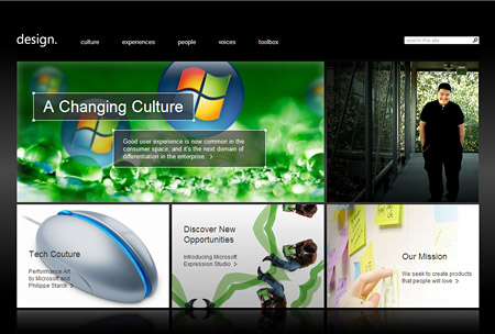
You don’t have to go far to learn more about the new design savvy Microsoft – the company now has an entire website devoted to spreading the word. Microsoft Design Center details Microsoft’s mission to bring good design to the world:
Good user experience is now common in the consumer space, and it’s the next domain of differentiation in the enterprise. Effective user experience in software and computing is not perceived as a nice surprise when we find it — it’s now an expectation that our experiences will be pleasant, secure, productive, delightful, useful, and adaptive […] Microsoft is creating a new paradigm for creating compelling digital experiences.
It’s difficult not to be at least a little skeptical of Microsoft’s motivations. As every web designer knows, Microsoft tend to stop innovating once they have firmly cornered a market. When Internet Explorer 6 ‘won’ the browser wars, Microsoft indefinitely abandoned their web browser development program, and it was only when Firefox started eating into their market share that they jumped back in the game. I think the same is the case with the company’s newfound interest in design, only this time it is the success of Apple’s design driven marketing that has given Microsoft a swift kick in the pants. On the Microsoft Design Center website the Apple iPod is singled out as an example of great design, and it’s hard to imagine Microsoft’s Vista operating system existing in its current form were it not for the innovations of Apple’s OS X.
Impure motivations aside, I think it’s great that Microsoft have finally realized the value that good design can add to their products, marketing, and public image. Vista is the most striking example of this new design philosophy in action, but I’ve noticed that Microsoft have stepped up their game right across the board, including the design of their software titles, electronic devices, and websites. Here are a few examples:
Optical Mouse
Microsoft tapped iconic product designer Phillipe Starck to devise their first piece of ‘designer’ hardware, the Optical Mouse. To me it looks about as functional as Apple’s appallingly unergonomic pill shaped mice, but from a purely aesthetic perspective it certainly has its appeal.

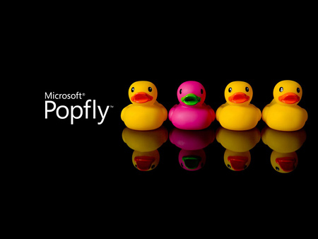
Popfly
Popfly is Microsoft’s foray into the ‘mashable’ web, and a direct competitor to Yahoo Pipes. Popfly’s simple, elegant branding is a far cry from the cluttered design and corporate blue and white we have come to expect from Microsoft.
Vista
I’m sure by now you’ve seen at least screenshots of Vista, and know that Microsoft is hoping that Vista inspires the same “wow” factor that Mac OS X did on first release. I’ve been using Vista as my primary operating system at work for about a month now, and in my opinion the GUI definitely lives up the hype.
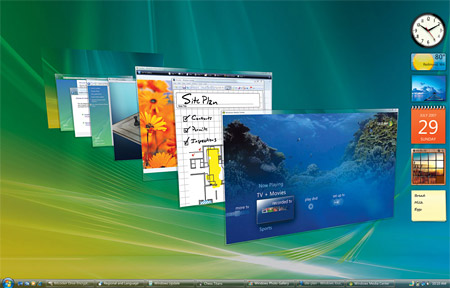
With impressive ‘glass’ effects, icons by Icon Factory, and 3D tabbing between applications, Vista helps puts Microsoft back at the cutting edge of user interface design.
![]()
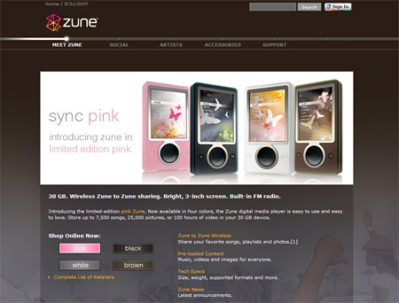
Zune
A year or two back a hilarious video was doing the rounds that posed the question: what would the iPod’s packaging look like if it had been designed by Microsoft? In the video the minimal iPod packaging was transformed into a perfect representation of ‘design by committee’, a visual cacophony of product endorsements, company branding, disclaimers and technical specifications. The message was simple: Apple understand good design, whereas Microsoft are too caught up in corporate bureaucracy to ‘get it’. Well, Microsoft did end up designing their own portable music player, and judging from its packaging they learned from past mistakes. It’s a shame then that they chose brown as the trademark color of the Zune. My guess is that brown was the only color Apple hadn’t already used in their iPod Mini range.

Zune may not have been the iPod-killer Microsoft were hoping for, but I still think they got it right with the Zune website, which in my opinion has a tad more personality than the iPod micro site. In an odd reversal, Apple’s iPod site seems more… corporate!
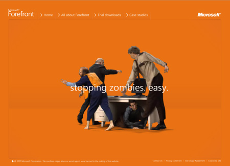
Forefront microsite
The quirky online campaign for Microsoft Forefront makes good use of Flash video to portray would-be hackers as bumbling zombies and incompetent aliens. It’s a humorous twist on Microsoft branding, and like much of the company’s recent marketing it is friendly and bright rather than drab and corporate.
6 thoughts on “Microsoft’s new design philosophy”
Comments are closed.
Wow some of those designs look very classy and web 2.0 and even a little mac-ish
I am guessing that the designers for Mac must have moved over to PC
@Jermayn
They wear their influences on their sleeve, don’t they!
I’m not sure how many people realize it, but Icon Factory who did the icons for Windows XP and Windows Vista also create icons for Apple. So it really is the case that some of the same designers work for both companies!
I was only actually joking with my comments about the designers swapping boats
Microsoft has done a great job of re-aligning themselves and investing resources in user experience. The quote from MSFT’s design site is a truism for just about every modern company and I have a feeling that MSFT fully believes in that message (ignoring the nebelulous “Microsoft is creating a new paradigm for creating compelling digital experiences” part).
Your cited examples show a rather interesting approach to branding. Each seperate product, or group, has unique branding that is a departure from the core MSFT brand. This fragmentation and uniqueness opts for a stronger emotional connection with a small audience segments rather than a unified approach, targetted to all, that fails to stir a single soul.
Allowing such autonomy on a per-group level is pretty interesting. I’d imagine such splintering is necessary when you have to steer a 75,000 person ship and want more agility in your workforce.
What they are doing runs opposed to the traditional model of branding and design, where unity and cohesion are favored accross all product lines (think Apple). Even though I prefer the traditional approach, I’ve certainly been more receptive towards Microsoft’s design efforts as they slowly build their inertia on the design front.
As a side note: the If-Microsoft-Designed-the-iPod-Packaging video was put together by a Microsoft group to prompt internal change.
@Ephram Zerb:
I noticed that too. It is something that seems to go beyond the design of a product range and is evident in the way product teams are structured, and in the language used to describe them. On the Popfly website the product team describe themselves as if they were a tiny startup rather than a division of the world’s largest software company:
Ha! I hadn’t realized that. Thanks for the heads up. I assumed the video was made by an Apple fan taking a potshot at Microsoft.
There is no end for Microsoft……No one can beat their technology as well as designes.