Category / Graphic Design

1

The demise of skeuomorphism

On Daring Fireball John Gruber proposes that the current enthusiasm for “flat” interface design can be explained by the introduction of retina displays. Gruber argues that high resolution screens are a natural fit for clean, typographic interfaces, whereas crude low resolution screens need skeuomorphism’s visual “parlor tricks” to disguise their inferior pixel density:

The trend away from skeuomorphic special effects in UI design is the beginning of the retina-resolution design era. Our designs no longer need to accommodate for crude pixels. Glossy/glassy surfaces, heavy-handed transparency, glaring drop shadows, embossed text, textured material surfaces […] work on sub-retina displays because sub-retina displays are so crude. On retina displays, as with high quality print output, these techniques are revealed for what they truly are: an assortment of parlor tricks that fool our eyes into thinking we see something that looks good on a display that is technically incapable of rendering graphic design that truly looks good.

If Gruber’s hypothesis is correct, then how can we explain the fact that highly skeuomorphic interfaces only started to appear en masse around 2008, when the iOS app store launched? UI designers have had to accomodate low resolution displays for decades, yet for the most part the dominant design styles have been “flat” rather than heavily textured or skeuomorphic. Even in recent years that has been the case, at least in the field of web design. The web design gallery siteInspire, launched in 2008, has showcased thousands of interfaces that are (mostly) devoid of decorative embellishments, which is a testament to the enduring popularity of minimalist design.
Continue reading

2

Book Review: Volume

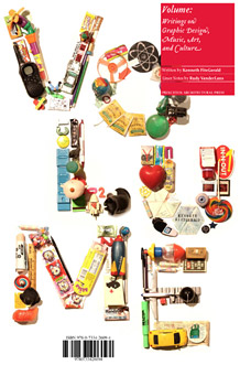
Volume book cover

While I was twiddling my thumbs waiting for my last Amazon shipment to arrive I asked my studio mate if he had any design theory books I could borrow. “Aha! I’ve got just the thing”, he said (or words to that effect) and plucked a copy of Kenneth Fitzgerald’s Volume from his bookshelf. The author’s name didn’t ring any bells, but the book’s back cover promised a survey of “the discipline of graphic design in context with the parallel creative fields of contemporary music and art”. Since I love graphic design, music and art, I figured I was on to a good thing.

Continue reading

12

Reconsidering Arial

My friend John Gillespie recently wrote about the inauspicious origins of the Arial typeface, namely that it is a blatant copy of Helvetica. While I agree with the general thrust of John’s argument (I’m a self confessed Helvetica fanboy) I do think that Arial has one redeeming feature that deserves mention, especially in the context of web design: Arial renders better at small point sizes on Windows systems than Helvetica does.

Continue reading

5

Ouch, my head just exploded

Remember the Max Headroom pilot, in which hyper-fast subliminal advertisements called ‘blip-verts’ caused viewers’ heads to explode? Well, that’s how I feel after absorbing 5000 web 2.0 logos in 333 seconds. Anyone get the feeling the world might have enough web apps already?

9

6 Photoshop time savers for web designers

Like many web designers, Photoshop is my tool of preference when it comes to doing website mockups. As such, I spend a decent chunk of my time working with the program, and have picked up a number of techniques that speed up my workflow. I’m not talking about creating shiny image reflections, or beveled starbursts, but rather simple tricks that shave a few minutes off your working day so you can go home earlier.

Continue reading

6

Microsoft’s new design philosophy

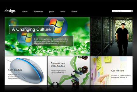
“Microsoft” and “design” are not two words you normally expect to hear in the same sentence. The image of PCs – and by implication Microsoft – as boring, corporate and unimaginative is well entrenched in the public imagination. It’s a stereotype that Apple has cleverly exploited for the popular “I’m a Mac / I’m a PC” television campaign, which personify a Windows PC as a dowdy paper pusher. It is interesting then to observe Microsoft’s recent efforts to reinvent themselves as a design oriented company, with user experience taking center stage in their new philosophy.

Microsoft Design Website

Continue reading

3

Creating black & white images with LAB

Everyone loves a good black and white photograph, they have an immediacy and elegance that’s hard to resist. But converting a color photograph to grayscale in Photoshop will often produce a lackluster result. Here’s a tip for creating black and white images that really come to life.

Continue reading

41

The visual design of Web 2.0

If you didn’t blink, you may have noticed that for a few days recently Wikipedia’s entry for Web 2.0 included a subsection describing the visual elements of Web 2.0. Gradients, colorful icons, reflections, dropshadows, and large text all got a mention.

A few days later the “visual elements” addition had been removed after a vote by wikipedians. The objection, I suppose, is that no set of visual criteria can accurately define something as being characteristic of Web 2.0 – if Web 2.0 can be understood as an approach to generating and distributing content, then it needn’t be tied to a particular visual style.

Nevertheless, it’s true that many Web 2.0 sites do share a distinctive aesthetic. Wikipedia’s editors may not think it’s a worthy part of the Web 2.0 discussion, but I say bring it on! Let’s take a look at the some of the communication issues facing a Web 2.0 site, and see how the “Web 2.0 look” can help to solve them.

Continue reading

0

AJAX load indicators made easy

If you plan on designing a kick ass AJAX application then you better make sure you’ve got a kick ass load indicator. That way your visitors will know that stuff is happening while you weave your AJAX magic behind the scenes.

Continue reading